The script that we use in the West – as well as many other things – goes back to Roman times where we can find the inspirational and lasting examples. By the first century CE, when most of western Europe was part of the Roman Empire, the authorities had widely adopted the use of Latin. At the time, the Roman Latin alphabet and script gave us imperial capitals carved in stone, rustic capitals painted on walls, and cursive script handled for daily writing. From this cursive script, uncial lettering developed that showed disconnected, capital letters without word separation. In the 4th century, when Roman power collapsed, and the Christian faith had been adopted, the art of writing became more and more confined to the monasteries. In the monastic environment, scripts developed local peculiarities and transformed into writing that often became difficult to read outside the immediate context. Thus, writing abilities diminished and texts deteriorated to such extent that by the middle of the 8th century, the call for standardization and readable texts could no longer be ignored. In order to be able to establish reforms, Charlemagne (742-814) requested scholars to develop a new script. Around 780, the scholar Alcuin of York designed what is known as the ‘Carolingian minuscule’, a script that soon became the standard in Charlemagne's empire.
The new script provided spaces between words, punctuation, and a hierarchy in letters: capitals for titles, a mix of capitals and lower-case letters for chapter headings, and lower case for the body of a text. This minuscule script was uniform, with rounded shapes in clearly distinguishable characters. It was soon disseminated and accepted everywhere across the Carolingian Holy Roman Empire and was used between c. 800 until 1200.

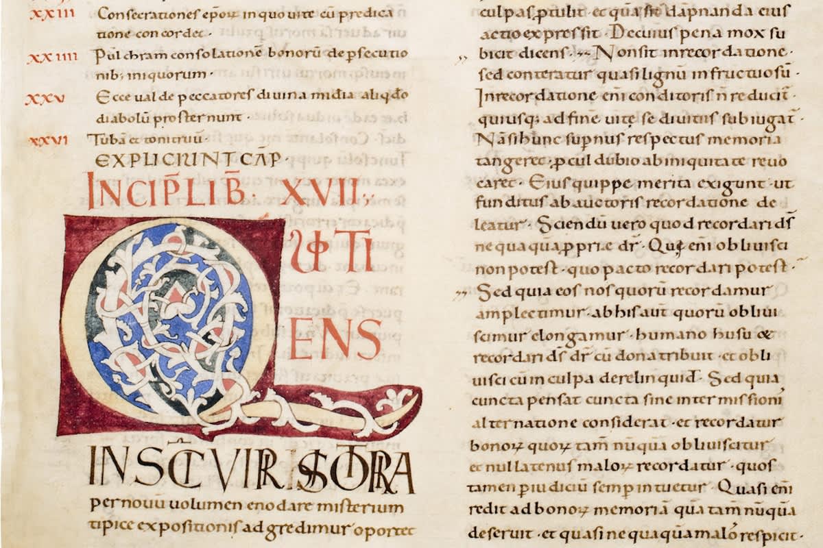
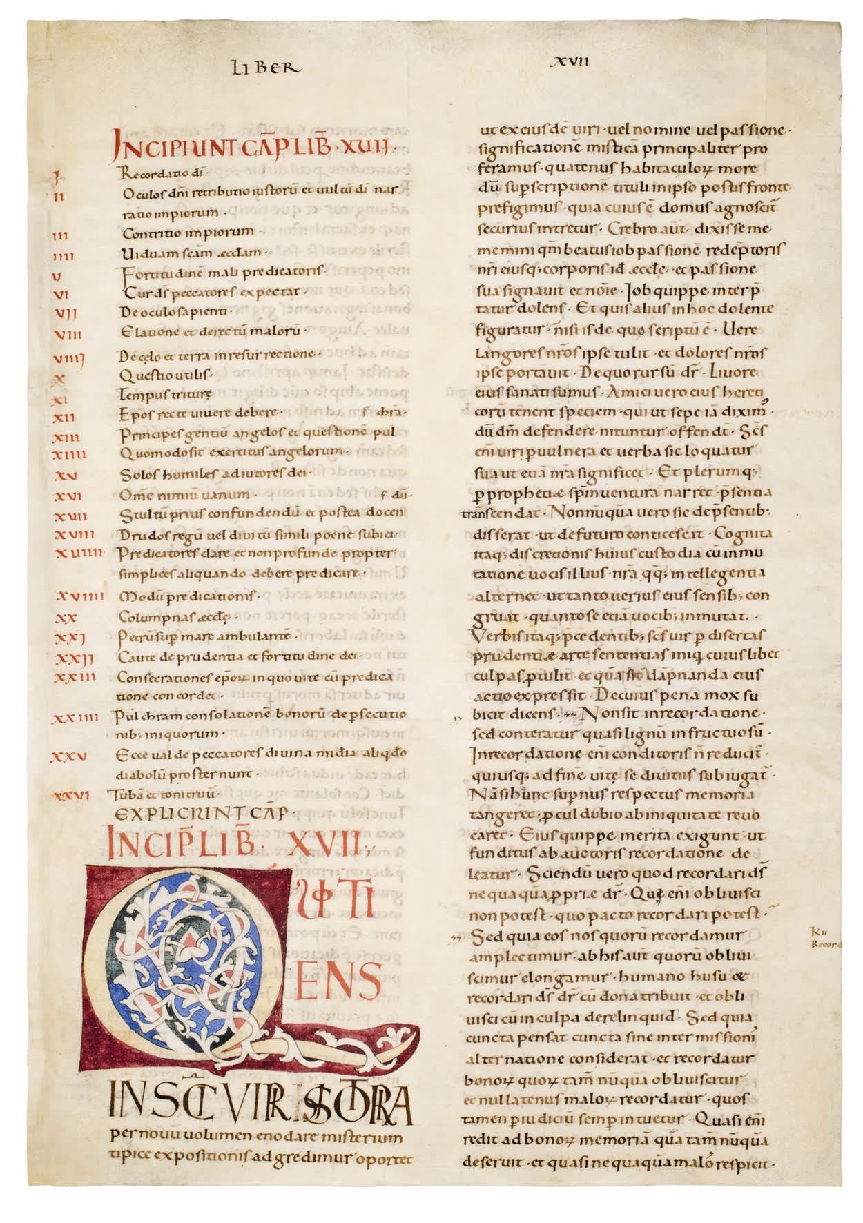
One of the important aspects of medieval manuscripts is the fine interplay of script and decoration. The oldest leaf shown here is a large folio (455 x 355 mm) decorated with an initial Q(uotiens....). It comes from a monumental decorated codex of the Moralia in Job, written in Latin by Pope Gregory the Great (c. 540-604), copied probably in Tuscany (Italy), possibly in Florence, and dating to c. 1080-1100.
Three quarters of the first column list the capitula for the text with chapter numbers in red. The rest of both text columns shows a squat and rounded high-grade late Carolingian book hand with capital A’s and M’s in the earlier uncial style. The fine initial Q is outlined in pale yellow, enclosing and partially encased by scrolling white vines, with some blue, green and red infills, on rich burgundy grounds, with four lines of finely painted ornamental capitals in red and black (the latter with letters overlaid on each other following the Carolingian fashion). The script and decoration of this large leaf points to manuscripts produced in Rome and Florence after the middle of 11th century.
The early Italian large format manuscripts stem from a tradition of ‘giant’ Bibles, written in double columns in a fine, rather archaic Carolingian script. The huge size of these Bible books gave them the title ‘Atlantic’ (after the giant Atlas). The texts derived from the 9th-century Bibles that were edited by Alcuin and then dispatched across Europe in the time of Charlemagne and his successors. It was then again in Rome, in the circle of the papal reformers of the 11th century, where these were copied anew, decorated and then sent north.

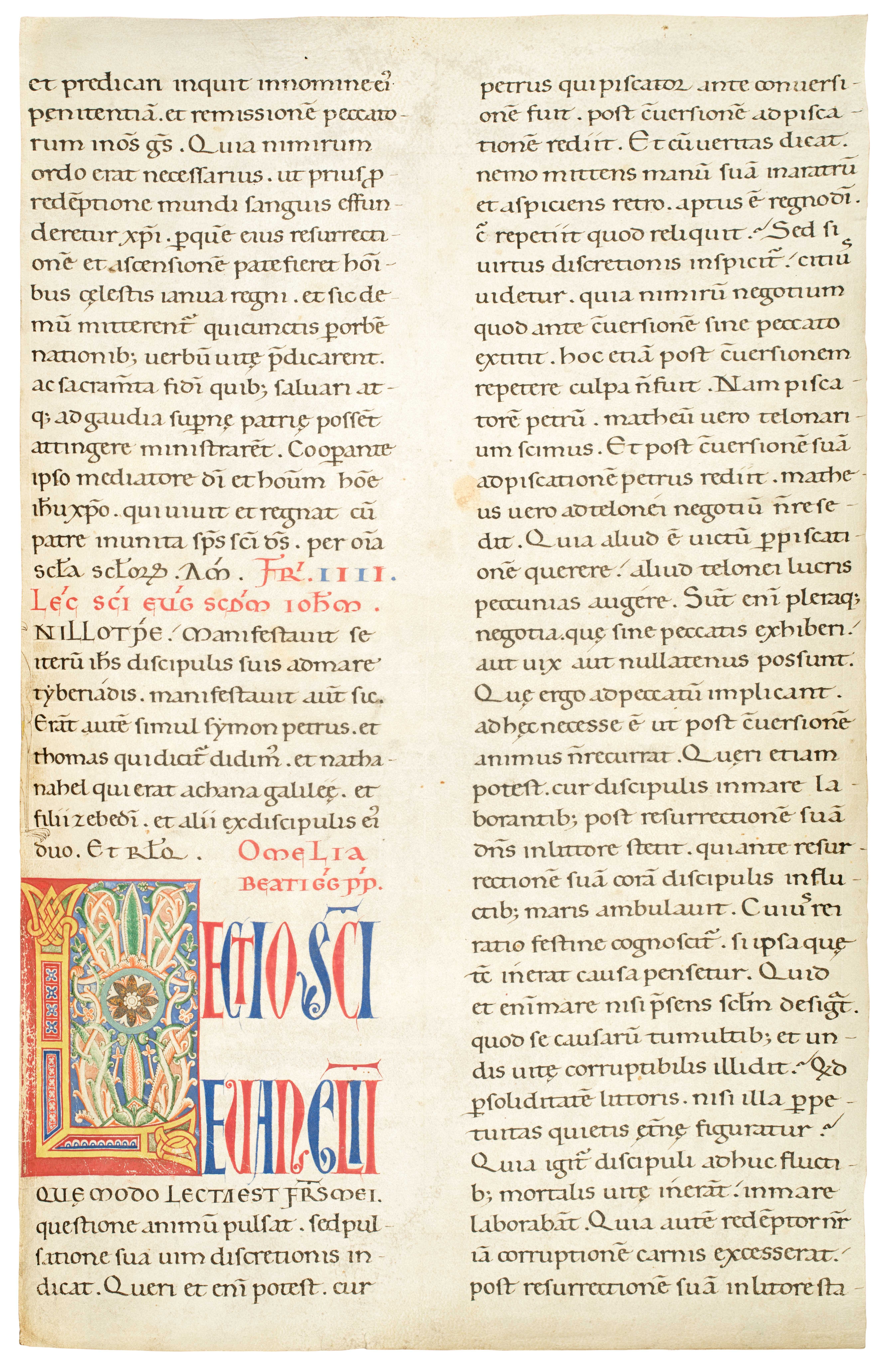
Pope Gregory I had also written a number of Gospel Homilies and took particular care that no inaccurate copies of these sermons were spread. The second leaf presented here, is a large folio with texts from his Homilies, also from Tuscany, but dating to c. 1175-1200. At the time, the Carolingian script was slowly evolving into a more compact Gothic script which allowed to fit more text to a page. The fine, illuminated initial L was placed on a bright red ground, its body was formed by intricate, bright yellow bands, and filled in with ornamented bars. The centre was marked by an eight-leaved flower in a circle. All elements here contrast harmoniously.
As you can see in these two examples, even today, we still draw on these letterforms, but that is another story.
Also see: Writing: making your mark at the British Library in London


